
And so it goes…
Butterfly sparkle, butterfly sparkle, pretty as petals in the sky you, flutter together, light as a feather, why can’t I be a but-ter-flyyyyy
Does anyone else know this song?! I think it was from a play when I was in primary school and I think my sister was the butterfly… Anyhoo, it features here because I couldn’t get it out of my head when I was painting recently. As my sister put it, “think of all the useful stuff that could be in my head instead of that”. Too true!
The painting in question is of a small tortoiseshell butterfly. I spotted my first small tortoiseshell of the year a few weeks ago and noted it in one of my weekly blogs. It was when we had a couple of really warm days in March. Since then – despite the colder mornings! – I’m pleased to say that I’ve seen quite a few more.

Small tortoiseshells are very pretty butterflies. Their colours are so bright and striking and they tend to stay with us in the UK all year round. I really wanted to replicate this in my painting – I needed to make it ‘sparkle’!
I started by drawing a rough sketch of the butterfly and tried to divide it up into clear sections so it would be easier to paint later. I decided I didn’t want a plain background so I added a few drops of water here and there and also sprayed a bit of water onto a couple of sections and then popped some oranges and yellows onto the wet paper.


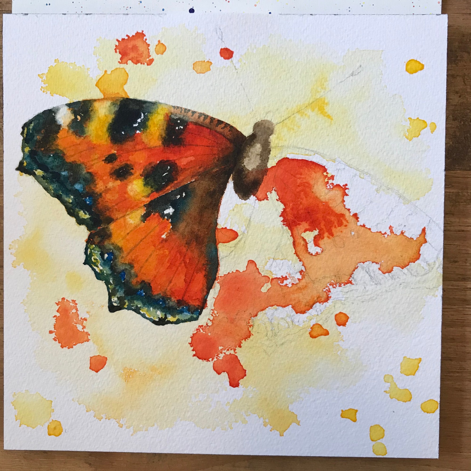

Once the background had dried, I added more colour to each of the wings in turn. I looked really carefully at the oranges and reds and also paid attention to the white spots on the top wings. One of the hardest things I find with watercolours is to know where not to paint. After you’ve added colour to the paper, it’s very difficult to get that crisp white back again! I think I read that the white spots are important because they differentiate the small tortoiseshell from the large tortoiseshell. That said, this article says that the large tortoiseshell is considered extinct in the UK so if you spot a tortoiseshell, it’s basically going to be the small one. Getting the white spots right was still important though!

I think I’ve got a lot better at adding layers of colour to watercolour pieces. Along with the detail. When I look back at a peacock butterfly I painted last year, you can see that the small tortoiseshell doesn’t look as dull or washed out. The detail is minimal but important – the lines on the wings, for example. Before I added these in, the wings just didn’t look right.


As for the composition, well, this is an example of a ‘happy accident’. When I drew the butterfly out at the beginning, I squeezed it all in so that the whole thing fit on the page. But it just didn’t look right – the top right wing was too small. Rather than start again and shift everything sideways, I decided to draw the butterfly so it spilled off the page. I wasn’t sure how it was going to turn out but I actually think it adds something to the piece. It works well with the splodges.
Hopefully I’ll see many more small tortoiseshells over the Spring and Summer!
